Showing posts with label colours. Show all posts

Monday, 11 May 2015

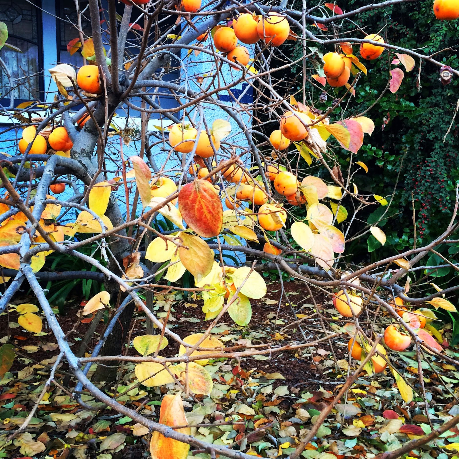
The autumn leaves

I love Melbourne in autumn.

The colours in the gardens and parks look glorious against the back drop of the grey skies.

The streets and paths are piled high with drifts of fallen leaves. It seems impossible that anymore could fall, but there are still more to come.
Drift leaves
© 2015 divacultura

The old Greek men in the neighbourhood spend their Saturday mornings with their plastic rakes and garden bins gathering the leaves together.

"Doing the council's work," one of them says to me as I pass.

On a windy day, the task is sisyphean.

The punt on whether the sheets will dry on the clothesline, often pays off, despite a sky that suggests otherwise.

I find a big pile of leaves irresistible when I'm out walking.

I hope the wind has blown them into a pile as I swish and swoosh through them.

Autumn colour
© 2015 divacultura

Green, yellow and brown
© 2015 divacultura


Thursday, 30 August 2012

Photo a day - CARD


CARD
(c) divacultura 2012
I got a little bit off track this month, but today, there is a marvellous confluence of circumstances.  These are the nine gratitude cards I have left after I gave one away today. I think they're beautiful.

Meet the artist, Jenny Peers, in today's Question Time.

Sunday, 12 August 2012

Photo a day - PURPLE

Purple is my favourite colour, so I was spoiled for choice of what to photograph.  Purple can be really tricky to capture realistically too.  I think I've done well with my sneakers.

PURPLE
(c) divacultura 2012

Tuesday, 17 July 2012

Another challenge - Granny a day

Yesterday I discovered Pip Lincolne's "A Granny a day" challenge on her blog, Meet Me At Mike's.  The idea is to rediscover the Granny square and make one a day.  It looks like this has been going for a while and I'm a late arrival, but that's okay.

I like the idea of one thing a day.  The focus often leads me to find unexpected inspiration and to make new discoveries.  I've fallen by the wayside with the photo a day challenge this month.  It's just not igniting my interest this month.  Instead, I'm going to crochet a Granny a day.

I don't like to over think these things so my approach to colour and construction is random.  I have a big basket of yarn in the colours that I like (you won't find yellow in there!).  Colour selection is achieved by closing my eyes and seeing what I come up with.

Granny squares take me back to when I first learned to crochet.  My real Granny taught me how to make one and my first project was ambitious.  I would make a giant Granny square which would be a square rug.  There would be one for me, one for my brother and one for my sister.  We still have them.  I started with mine and distinctly remember announcing my colours as being "autumn": green, orange and bone".  My sister's was shades of pink and my brother's was shades of brown (sorry Douglas!).

I remember my Granny's patience as she reminded me about how to hold the yarn, how to turn a corner, how to do a slip stitch.  We finished them off with rounds of double crochet and then Granny taught me how to do crab stitch - you basically crochet backwards.  This was sensational and felt very grown up to be able to finish things off in the same style as my grandmother, who was a very accomplished master of many needle crafts.

I haven't made a Granny square for years and it feels nice to go back to where I started.  I had to do a little research to remind myself of the details, but it has all come flooding back.

For those interested in the technical details, I'm using 8 ply wool (Shepherd's, Cleckheaton Country and Lincraft Superwash) that I have in my stash and a 4 mm hook.  I'm completing 7 rounds, completing the set up and the first two rounds in the one colour and then changing colour at the beginning of every round.  To avoid having a million ends to sew in, I crochet over the ends so there is none of that.

Here's the one I made yesterday (Monday 16 July):
The colours are actually pink - they look quite orange in this photo.
(c) divacultura 2012

Here's the second one I made yesterday.
This one does have orange in it!
(c) divacultura 2012

I'm yet to make one today.

I'll post back here with photos regularly for an update.  I wonder what they will become?

Why not join in?  It's a great opportunity to do something manageable and play with colour. It might inspire you to learn a new skill. You could even donate a finished blanket to charity.  I'd love to see your work!

Friday, 13 July 2012

My favourite things...this week.

This week, I'm struggling to find favourite things.  I seem to have spent most of the week sorting out problems with just about every aspect of my life.  I've spent hours talking to people in call centres being belted around the ears with the words "policy", "procedure" and "there's nothing we can do". Sigh.

1. In amongst that though, my high point was receiving my first reward for participation in the myki customer experience panel.  I've previously written about my experiences with myki and it hasn't all been pretty.  Participating in the panel requires a fair bit of time.  I'm happy to give that as I see it as part of my community contribution.  I'm learning a lot about the ins and outs of myki and it's great to know that someone is listening to the feedback that is being given.  Today I'm off to spend the first voucher I've received. Thank you!

2. Soup.  Especially home made!  On the weekend I bought some lamb shanks, put a pot on the stove and made some Scotch broth.  With the pearl barley and the clear broth, this soup reminds me of my Granny who always made it.  The resulting soup is sweet and nourishing.  I feel better immediately when I sit down to a big bowl.  I've put some portions away in the freezer so they're available when I just don't feel like cooking.


3.  My new iphone 4s.  I wasn't looking for a new phone but then the offer from Vodafone came along and I decided I may as well take advantage.  I'm always concerned about the built in obsolescence with our gadgets.  Experience tells me that if I ignore the opportunity to secure a new phone, my old phone (which is about 18 months old) would probably die the very next week.  It's largely the same as the iphone 4 except for Siri, the assistant.  I've only had the phone for a day and already Siri and I are friends.  It's so much easier to say what I need than typing on the phone.  Great innovation and I like that she has a local accent.
9 days after application in colour "Here today, Aragon tomorrow"
(c) divacultura 2012


4.  Gel nail colour.  During the winter months I really love to wear rich dark colours on my nails.  The problems with these colours is that even with the best manicure techniques, they usually start to look shabby after four or five days.  I'm always sceptical about claims about nail polish that will wear for weeks without chipping, but I decided to try OPI's new gel colour.  I'm hooked.  It really does wear for weeks!  I've had three applications about three weeks apart.  There's a bit of fiddling to get the colour off, but once it's on and cured, the colour is set.  No more smudges in the first hour.  


5. Electronic billing.  I know that receiving bills is no one's favourite thing, but paperless billing has to be one of the greatest things in the world.  My ultimate goal is to receive ONLY electronic bills.  I have a little way to go, but I'm getting there.  It's so much easier to file and keep track of records and they don't take up physical space.

Wednesday, 4 July 2012

Blooming flowers - making a little bit of spring

I've been admiring the Blooming Flower cushion over at Attic24 for a while.  With a stocktaking sale on at my local yarn store and a lovely assortment of colours available in cotton, I decided to make one for myself.
(c) divacultura 2012

Choosing the colours was easy.  I just bought one ball of every colour I could see and then used them randomly.  I love clashing, random colours together.  The end result can be rather spectacular.  When I say random, I mean I just put my hand in the bag and used whichever colour I had in my hand.  I've heard that some people go even further and roll a die to determine the colour sequence.
(c) divacultura 2012

Looking at this cushion makes me happy.  It's brought a little bit of springtime sunshine into winter.  I might even make another one.

(c) divacultura 2012
Lucy's tutorial at Attic24 is excellent.  If you follow that, you can't really go wrong.  I do suggest that you count everything on every round though!  Much better to discover a missing stitch quickly than to have to rip hours and hours of work.
(c) divacultura 2012

Here are the technical details:

Yarn: Panda Cotton Blend 8 ply
Hook: 4mm
Cushion insert - 16 inch diameter

What do you think of my pillow?  Will you make one too?

(c) divacultura 2012

Sunday, 24 June 2012

Photo a day June - ON YOUR MIND

I've been experimenting today.  I became obsessed with adding a soft brown and pink scarf to my wardrobe.  On an impulse I bought some variegated yarn which met that criteria and tried a few different patterns to knit it into an interesting and wearable scarf.  I tried chevrons first, but it wasn't really pleasing.  Then I tried some multi-directional triangles which were fun and interesting, but didn't really work with the yarn.  After a few hours of knitting, I ripped both out and put the yarn away.  (As I write this, I've remember that I have a rather gorgeous chocolate and pink crushed velvet scarf already.  Must find it.)

So I returned to socks and pulled out some yarn whose colour is called Hoochie Mama.  On my mind today has been the journey of yarn from a skein to a cake to a finished product.  The socks aren't finished, but the cuff is and you get the idea...

ON MY MIND
(c) divacultura 2012

Wednesday, 20 June 2012

Spotted around town today

On my journeys around the city today I came across the delightful crocheted window at Morris and Sons above Dymocks in Collins Street.

Looking in.
(c) divacultura 2012

See the bike?  At the back?  On the left?

On yer bike!
(c) divacultura 2012

Is that crocheted Basil Brush posing as a seat cover?

Crocheted window from the inside.
(c) divacultura 2012
I love this colourful fix of crocheted funkiness.  Why not wander up and have a happy, colour, infusion?

And on my way through the village, I noticed this sign on the window of a shop that has been empty for a little while:

Yarraville surprise...
(c) divacultura 2012

Can't wait to find out what it is!  Anyone know?

What have you seen today?

Friday, 15 June 2012

Photo a day June - YELLOW

I don't do yellow.  Until today, the only yellow things in my house were some lemons and some post-it notes.

Then I made this little origami fish.  He's swimming with an orange one on the wild waters of the fridge.

YELLOW
(c) divacultura 2012

Sunday, 10 June 2012

Photo a day June - Your view today

I got all mixed up!  "Your view today" was the photo a day theme for Saturday.  I thought it was for Friday.  Friday's theme was "6 o'clock" which I completely failed to meet.  So I thought I'd show you my view over the last couple of days.

My View Today
(c) divacultura 2012
This is the "official" photo of my view yesterday.  Wandering around the city in the rain after choir practice yesterday, this display of colour in Australia on Collins caught my eye.  The umbrellas were suspended over about three floors.  The bright colours were a lovely contrast to the grey Melbourne weather.

This was much better than my view the day before.
(c) divacultura 2012
I spent Friday in this room at St Vincent's hospital.  I wasn't unwell, I was working as a simulated patient for medical students' exams.  That pale green they paint everything in hospitals with is enough to make me feel green around the gills.  Add some very strong fluorescent lighting and you've got the perfect circumstances to drain life from otherwise healthy people.

If I looked a little to my left I could see this.


(c) divacultura 2012

At 6 o'clock I was tucked in a Thai restaurant in a Melbourne laneway having a very early dinner with a friend who had also been working at St Vincent's.  No photo of that.

There were two other lovely views from yesterday that I want to share with you.
(c) divacultura 2012
Rather than drive to choir practice on a Saturday, I've started catching the train.  It actually takes less time and is much cheaper.  I have time to buy a coffee after I arrive at Flinders Street before my connecting train leaves and I always enjoy having reading time.  Yesterday, the park at Clifton Hill looked particularly lovely. The trees with their thinning, brightly coloured foliage, the lush green grass sprinkled with the fallen leaves and the tree trunks black from the rain. I didn't mind walking in the rain when I could see such a lovely piece of nature.  (I have used a filter on this photo to emphasise the contrast.)

Outside my rehearsal space there is a herb garden.  It's lovely to watch it change through all the different seasons.  In summer the aroma of basil permeates the garden.  Here's what it looked like yesterday.
(c) divacultura 2012
The window has a mirror finish and there's a seat to sit and contemplate. I love the brick wall behind it with its peeling paint.

Tuesday, 1 May 2012

Before and after dolly mix

Recently I bought some hand spun and hand dyed merino wool on Etsy from Sheepish Sarah.

I knit the whole thing into a triangular scarf.

I'm wearing it right now.

The joy of knitting with this kind of yarn is the surprise of how the colours will show themselves.

Here's a before and after shot.
© divacultura 2012

The colour is called Dolly Mixture and it really does look like one of those little jars of tiny boiled lollies, called dolly mix.  I wonder why?  Is it because they are lollies for your dolly?  Dolly lollies.

Well I do know that this scarf is delicious.


Monday, 30 April 2012

A purple patch.

In the middle of some intense days of work, I took a little time out (30 minutes to be exact) to have my regular manicure.  It's a habit that I go in and out of, depending on what else is going on in my life and how the cash flow is.

When I'm feeling constrained by the requirement to wear a suit, I love to splash on some colour - or go dark and gothic.  Maybe I wear colour on my nails the way men wear ties.

My favourite place to go is the OPI nail bar in David Jones in the Bourke Street Mall.  Prices start at about $10 to just have your nails painted.  The prices go up, the more you have done, but are still reasonable.  It's a great place to sit and watch shoppers.  With all of the OPI colours on display, I love to watch shoppers browse the range and try to predict what they will choose.

I've had some really interesting conversations with other women while we have our nails done too.  It's a networking hot bed!  I've also noticed that I'm usually the girl with the wildest colour choice.

I hadn't been for a while because of life circumstances and I've been three times in the last three weeks.  There are new people there and we're all acquainting ourselves with each other.  The first week, I chose a grey-blue called "I have a herring problem" from the new Holland collection.  The following week I went dark and chose "Here Today...Aragon Tomorrow" which is a green based black from the Spanish Collection.

This week, I went back to Holland and was the first person ever (at the OPI nail bar in David Jones Melbourne) to have their nails painted with a glorious, perfect purple called "Dutch 'ya Just Love OPI?"  Every time I look at the colour I fall in love.
Perfect Purple (c) divacultura 2012
Purple is notoriously difficult to photograph.  Add a little more red and take out a smidgen of blue and you've got the colour.

While I was being painted purple, I admired the New York City Ballet collection which is all very soft pinks, lilacs and blues.  The woman painting my nails shook her head saying they were very nice, but "they're not for you - too subtle!"  What's next?  I really want to surprise her by choosing "Don't Touch my Tutu" but I think I'll go back to Holland and choose "Vampsterdam".

In case you're wondering how I remember all the names and colours - there's an app for that!

Friday, 13 April 2012

My favourite time of year

Autumn is the very best time of year in Melbourne.  The sun shines and there's a refreshing crispness to the air. It's possible to go outside without living in a hay fever haze. Layers and layers and layers of clothes are not required and we don't have the notorious four seasons in one day which afflicts Melbourne in spring.  The nights are lovely and cool and clear.

If it was possible to have autumn all year round, I would be happy!

I haven't seen the colour of autumn yet, which is amazing because we're half way through.  I did notice that the bright green leaves I featured in this post in November last year have faded a little.
Summer juiciness (c) divacultura 2012


Faded glory. (c) divacultura 2012
But it's the same stunning blue sky. And we're heading for 25 degrees Celsius today.  Perfect.

Saturday, 10 March 2012

Photo of the day - RED

Photo theme for 9 March is RED.  Here's my collection of red lipstick!
(c) divacultura 2012
*I used the Valencia filter on instagram.

Tuesday, 13 December 2011

Neighbourhood blooms

As I walk around my neighbourhood I'm often struck by the beautiful flowers in the gardens.  The summer colours are beautiful.  Today I particularly noticed the pinks and purples.  Join me for a wander through the gardens?


Sunday, 4 December 2011

Chevron stripes

Here's how I spent this wintry Sunday: knitting and talking to friends on the phone.

I'm having a rest from socks for a while and am enjoying knitting this chevron striped sarong designed by Jo Sharp.  I picked up the bamboo and merino blend using a loyalty voucher and some cash which was a birthday gift. (Thanks Mum and Dad!)

How do you like the colours I have chosen?  I quite like the original colour scheme, but couldn't get the yarn, so designed my own.

 The colours from left to right are Petal, Mandarin, Kingfisher, Vie en Rose and the dark purple is called Dover.
 I'm loving the chevron stripes.  It's the first time I have knit a pattern like this.  It took some concentration to get the hang of it, but now that I'm using stitch markers to define the pattern repeats, I'm finding it quite meditative.

Monday, 7 November 2011

Colour your world.

Colour is so inspiring.  I just went out for a walk.  It's a beautiful day here in Melbourne.  Have a look at this:

(c) divacultura 2012
Clear blue sky and bright, bright green leaves.  Nature puts blue and green together, so I wonder why someone said that "blue and green should never be seen, unless there's a colour in between"?  I think the colours are glorious together.  In real life, the leaves on these trees are almost fluorescent green.  There's a row of about six of them and they look so alive.

Some of my favourite colour combinations are ones that would generally be thought to clash.  I bought a new umbrella the other day:

(c) divacultura 2012
Pink and red!

I also love pink and orange or red and orange together.  They really make a statement.

My couch is red velvet with purple piping and I have an ottoman which is the reverse - purple with red piping.  Check out the funky geometric red and purple cushion (by Nicola Cerini.) 

(c) divacultura 2012

This ottoman was a 30th birthday present from my friends.  It's not quite vintage yet.

(c) divacultura 2012


The socks I'm knitting at the moment are skinny stripes of purple and turquoise.
(c) divacultura 2012

There's so much colour in the world and I love to have it in my house and wardrobe.  The other day I wore a purple dress with orange sandals and was paid compliments all day on the joyful colour combination!  I just put it on because it was clean and ready to wear.  It was so lovely to have the colours noticed.

When asked whether particular colours would go together, my mother would always respond by saying "if you put it, it goes".  I guess I have taken that advice completely to heart.  I put colours together all the time without fear.  They go!

I've often wondered why certain colours are appealing to one person and not to another.  My aversion to yellow is well known but I know many people love the "sunniness" and cheerfulness of yellow.  I look at yellow and the word that comes to mind is "rancid".  I can not wear yellow - it makes me look like an 87 year old Greek widow or someone with a very bad case of jaundice.  Perhaps that is why I don't like it.

How do you colour your world?  What colours or combinations make you feel happy?  What's your "yellow"?